The mentioned functionalities may be restricted depending on the purchased software license.
公共展示模板管理
公共展示模板是您自定义可视化的基础。它们定义了将应用于您的安装的布局、结构和视觉元素。本综合指南涵盖从基本模板创建到高级设计技术的所有内容。
📋 概述
公共展示模板是什么?
模板作为可重用蓝图,能够:
- 📐 定义公共展示的视觉布局
- 🧩 组织内容块及其位置
- 🎨 在多个安装中建立设计一致性
- ⚙️ 使标准化可视化的快速部署成为可能
- 🔄 支持所有链接配置的轻松更新
主要好处
| 好处 | 描述 |
|---|---|
| 🚀 效率 | 一次创建,可用于多个安装 |
| 🎯 一致性 | 维护统一的设计标准 |
| 🔧 灵活性 | 轻松修改,无需重新从头开始创建 |
🚀 开始使用
模板工作流程
- 📐 设计布局 - 规划您的视觉结构
- 🎨 创建模板 - 使用模板编辑器构建
- 💾 保存模板 - 方便在多个安装中重用
前提条件
在创建模板之前,请确保您拥有:
- ✅ SmartgridX帐户,并具有适当权限
- ✅ 清晰的设计目标,用于您的可视化
- ✅ 内容要求(图像、数据点、布局)
🎛️ 模板管理界面
访问模板管理器
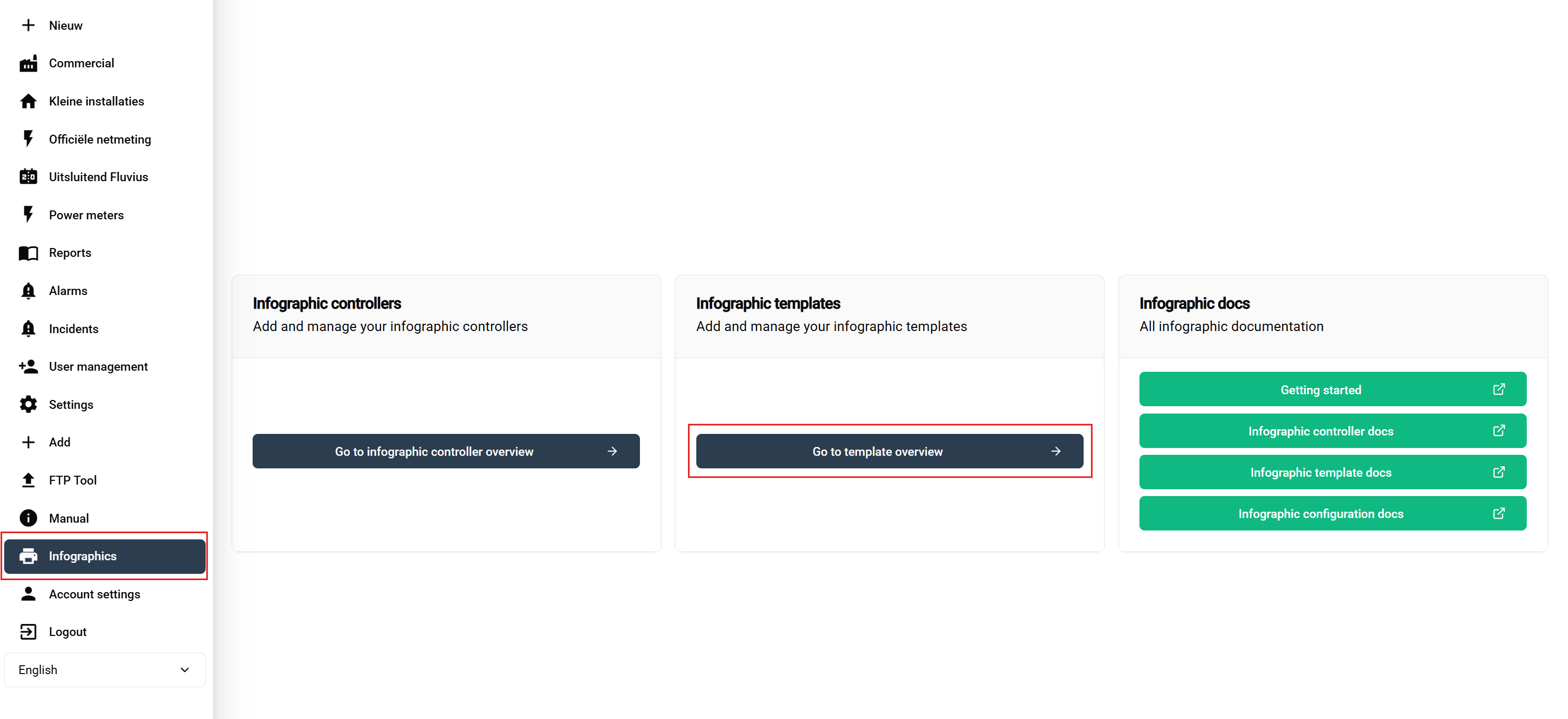
导航步骤:
- 登录到您的SmartgridX帐户
- 在主侧边栏中导航到**‘公共展示’**
- 点击概览页面上的**‘公共展示模板’**按钮
这将打开模板管理界面,您可以在其中查看、创建、编辑和删除模板。
模板概述表
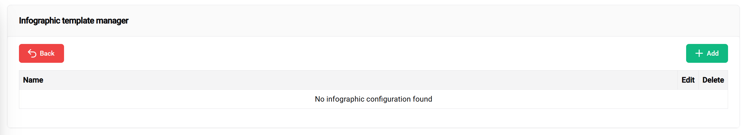
可用操作:
- ➕ 添加 - 绿色按钮以开始模板创建
- ✏️ 编辑 - 修改现有模板设计
- 🗑️ 删除 - 移除未使用的模板
🎨 模板创建流程
开始新模板
点击**"创建新模板"**按钮以打开模板编辑器界面。
模板标题配置
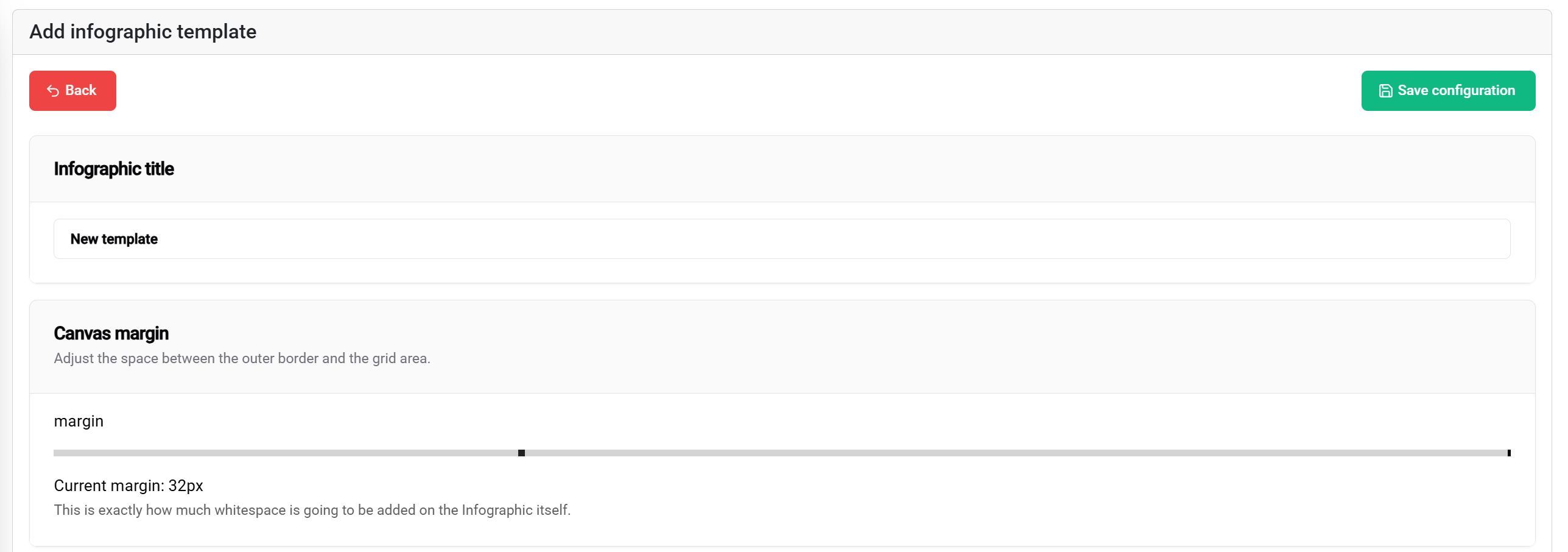
标题设置
模板标题:
- 目的: 在列表和配置中标识模板
- 最佳实践: 使用描述性、项目特定的名称
- 示例: "Factory-KPI-Dashboard", "Energy-Monitoring-Layout", "Multi-Zone-Display"
边距配置
边距设置定义展示边界的安全区域:
边距滑块(0-100px):
- 📐 范围: 距离展示边缘0到100像素
- 🎯 目的: 创建安全间距,以防止内容被截断
- 📱 应用: 确保在各种显示类型上的可见性
- ⚙️ 推荐: 标准显示使用10-20px,边到边的屏幕使用30-50px
视觉影响:
- 0像素边距 - 内容延伸至显示边缘
- 50像素边距 - 内容距离所有边框50像素开始
- 100像素边距 - 最大安全区域,具有较大的边界间距
保存功能
�💾 保存按钮(右上角)允许您保存当前模板。
🧩 块布局系统
理解网格系统
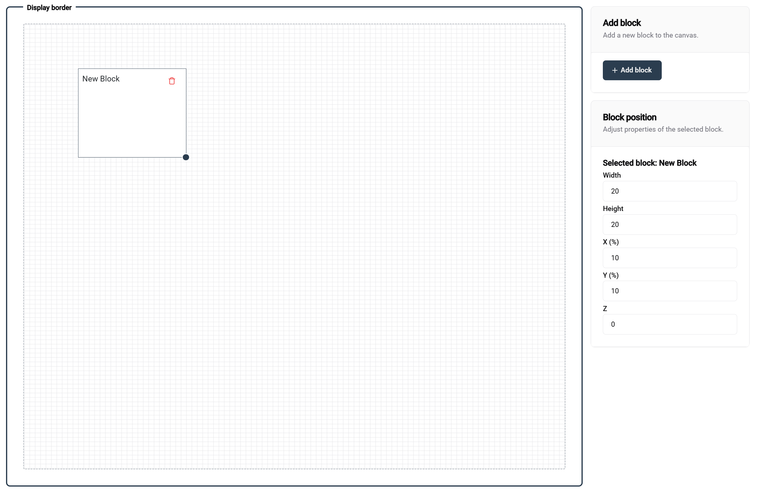
网格基本知识
模板编辑器使用100×100百分比基础的网格系统:
网格属性:
- 📐 尺寸: 100单位宽 × 100单位高
- 📊 单位: 百分比值(1单位 = 总尺寸的1%)
- 🎯 精确度: 允许精确定位和尺寸设置
- 📱 响应式: 自动适应不同屏幕大小
块布局示例
- 🖼️ 单块
- 📊 并排
- 📚 堆叠布局
- 🔲 四分之一布局
配置: 100宽 × 100高
结果: 全屏覆盖
使用案例: 单个大型可视化,全屏图像
┌─────────────────────────────────┐
│                                 │
│         FULL BLOCK              │
│                                 │
│                                 │
└─────────────────────────────────┘
配置: 两个块,50宽 × 100高
结果: 分屏布局
使用案例: 比较视图,双数据展示
┌─────────────────┬───────────────┐
│                 │               │
│    块 1         │   块 2        │
│                 │               │
│                 │               │
└─────────────────┴───────────────┘
配置: 两个块,100宽 × 50高
结果: 垂直堆叠
使用案例: 标题/内容,标题/详细布局
┌────────────────────��─────────────┐
│ 块 1 │
│ │
├─────────────────────────────────┤
│ 块 2 │
│ │
└─────────────────────────────────┘
配置: 四个块,50宽 × 50高
结果: 象限布局
使用案例: 多指标仪表板,比较网格
┌─────────────────┬───────────────┐
│    块 1         │   块 2        │
│                 │               │
├─────────────────┼───────────────┤
│    块 3         │   块 4        │
│                 │               │
└─────────────────┴───────────────┘
块操作
添加块
方法: 点击**"添加块"**按钮(编辑器右上角)
结果: 新块以默认尺寸出现
后续步骤: 根据需要定位和调整大小
定位块
拖放:
- 🖱️ 点击并保持任何块以移动它
- 📍 实时预览在拖动时显示位置
- 🧲 网格捕捉有助于精确对齐
- 👁️ 可视化指南在对齐时出现以提供帮助
调整块大小
调整大小手柄:
- 📐 右下角选中块时显示调整大小手柄
- 🔧 拖动以同时调整宽度和高度
- 📊 实时值显示当前尺寸
精确控制
右侧位置面板
选中一个块时,右侧面板提供:
位置控制:
- 📍 X位置 - 从左边缘的水平偏移(0-100)
- 📍 Y位置 - 从上边缘的垂直偏移(0-100)
- 🎨 Z索引 - 重叠块的层次顺序
- 📏 宽度 - 块宽度百分比(1-100)
- 📏 高度 - 块高度百分比(1-100)
⚙️ 块配置
块类型和属性
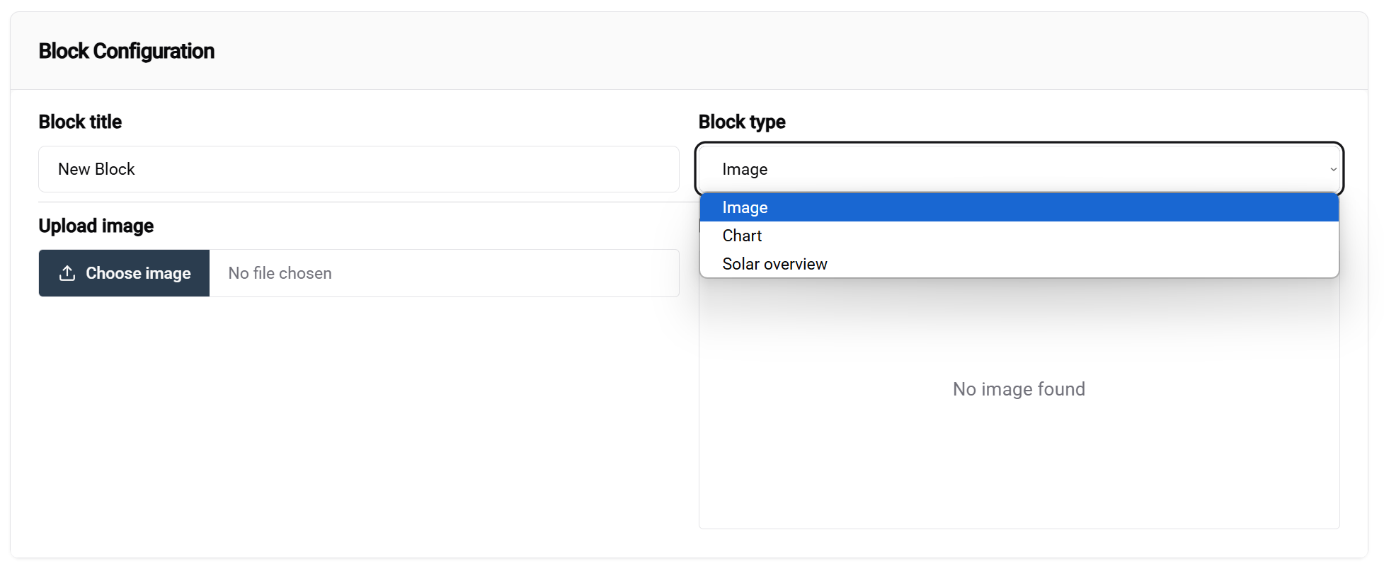
访问块配置
方法:
- 在编辑器画布中选择一个块
- 配置面板出现在屏幕底部
- 块类型下拉菜单是主要配置选项
注意:当前并非所有块都是可配置的。随着开发的进行,这一点会有所改变。未来的更新将增加更多块类型。
可用块类型
- 🖼️ 图像块
- ☀️ 太阳能概览
- 📈 图表块
目的: 显示静态图像、徽标、背景、GIF动画
配置选项:
- 📁 图像来源 - 将用作此块的默认值的上传或URL。如果您希望在配置中强制选择一张图像,可以将此项留空
用例:
- 公司徽标和品牌
- 背景图像
- 设备照片
- GIF动画
目的: 显示实时值
用例:
- 快速概览您的太阳能数据
目的: 可视化数据趋势和比较
配置选项:
- 📊 图表类型 - 折线图、条形图
用例:
- 可视化实时生产和能源数据
模板示例
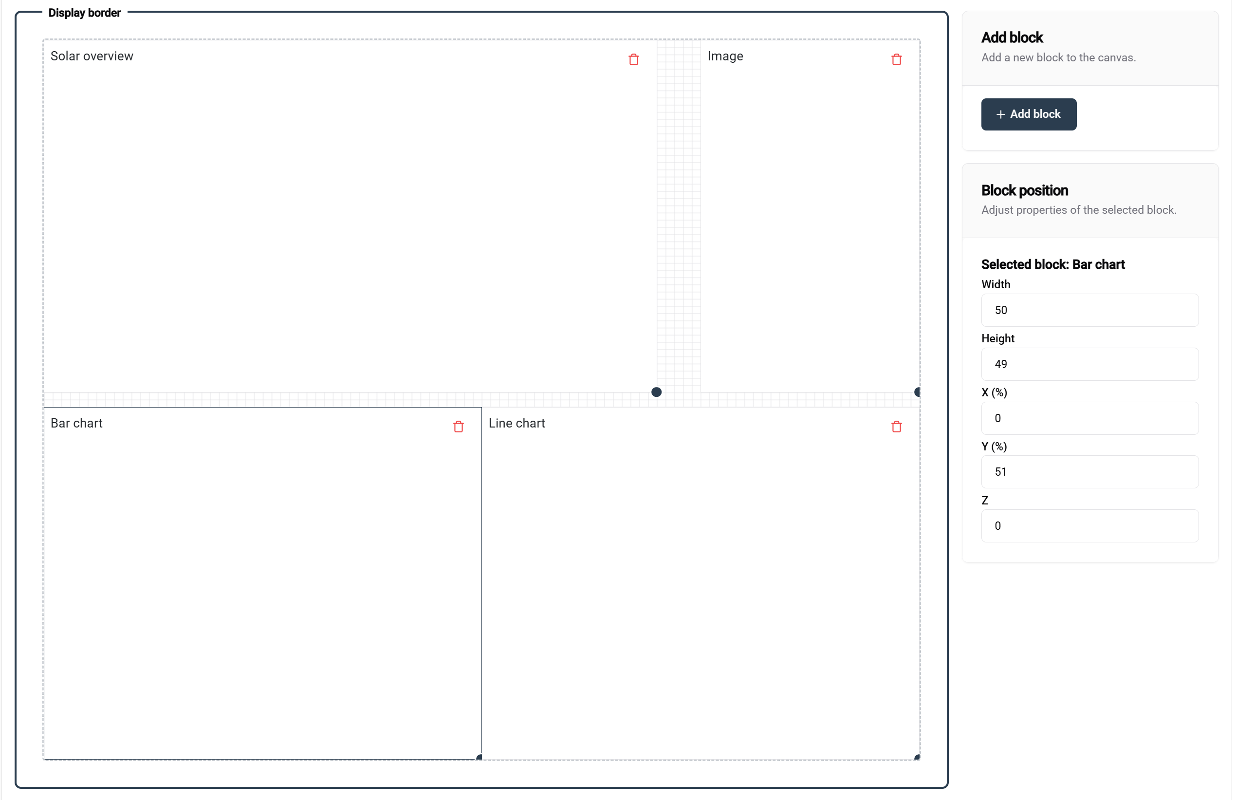
此示例展示了一个结构良好的模板:
- 📊 清晰的块组织,带有描述性标签
- 📐 适当的间距和对齐
- 🎯 针对不同内容需求的功能块类型
此示例中的块命名:
- 每个块显示其预期目的
- 清晰的标签有助于配置
- 逻辑组织支持维护
📚 相关文档
后续步骤
在创建模板后:
高级主题
- 🎨 高级设计技术
- 📊 自定义数据集成
- 🔄 自动模板更新
- 👥 多用户模板协作
💡 最佳实践总结
模板设计
✅ 设计原则:
- 🎯 保持简单 - 专注于重要信息
- 📱 响应式设计 - 在不同屏幕尺寸上测试
- 🎨 保持一致性 - 使用标准化颜色和布局
模板管理
✅ 组织提示:
- 📝 使用描述性名称 - 使模板易于查找
- 🔄 定期维护 - 删除未使用的模板
- 👥 分享标准 - 确保团队一致性
🎨 准备设计了吗? 创建并配置好您的模板后,您准备在 SmartgridX 安装中部署惊艳的可视化效果!